Okanagan College
Adding depth and hierarchy to a flat wayfinding experience
Background
Okanagan College is a post-secondary institution with approx. 15000-20000 students each year. In this project, I created a scalable tabbed mega menu with CTA functionality and enhanced tooltips designed for digestibility and intuitive wayfinding.
Role
UX/UI Designer
Team
2 UX/UI Designers
1 Product Manager
2 Developers
Timeline
5 months, shipped Jan. 2026
Skills
Systems design
Journey mapping
Prototyping
Information architecture
Stakeholder alignment
Impact
Designed 5+ components for our design system and collaborated with development for product requirements and seamless implementation.
Aligned 10+ departments through cross-functional feedback and design reviews.
Balanced multiple user segments and business constraints while maintaining focus on core user needs.
CONTEXT
Internal organization structure > User mental models
The OC website navigation is a key touchpoint for prospective student and current student wayfinding. It housed more than 300 prioritized content pages.
Over time, the navigation experience had evolved around internal organizational structures rather than how users naturally searched for information.
PROBLEM
We are not focusing on our primary users
“I find the site counterintuitive. I use Google to find direct links instead.”
-First year student at Okanagan College

“When I attempted to register, pages are spread across different areas of navigation rather than being all in one place.”
-Prospective student at Okanagan College

What needs to be solved?
Important content was difficult to find, users relied heavily on search, and high-value pages were often buried within a flat yet overwhelming menu structure.
UNDERSTANDING USER BEHAVIOUR
How do users currently navigate?
We analyzed navigation behaviour through Google Analytics and diving into most visited pages, least visited pages, high-priority pages with low traffic, and search bar usage. We also collaborated with the AskOC development team to get insights on our AI chatbot usage.

INSIGHT
Wayfinding follows the user (student) journey
Most visited pages and high priority pages reflected themes on discovery, student application, and current student resources.
Low traffic pages are often associated with staff-specific information or a page titled with heavy internal language such as Coordinated Support Services (Mental health or community support) or Success Centre (Academic support).
VERIFYING OUR FINDINGS
Users navigate through tasks themes not departments
My team met with different departments such as student recruitment, student advising, and student orientation; we also chatted with actual students roaming around campus where we discussed:
User (student) goals
Expectations
Typical bottlenecks in website navigation
Memories of website experience (if they're a first-year student)


DEFINING THE USER
Addressing both prospective and current student needs, but with prospective students at the forefront
While both current and prospective students struggled, we prioritized prospective students to address current student needs indirectly.
Higher sensitivity to friction
Prospective students who are key conversion leads leave immediately when facing obstacles. Current students persist due to sunk costs, masking navigation problems.
Exploratory vs. repetitive behaviour
Current students follow predictable paths (tuition, schedules). Prospective students explore broadly, exposing systemic navigation issues.
FIRST EXPLORATION
Flat hierarchy: Landing pages for user navigation
This idea focuses on a minimalist structure and core user needs to mitigate against competing priorities during this timeline.

Why I tried it?
Why I moved on?
Minimalism limited scalability and visual hierarchy.
Stakeholders were concerned about reducing content discovery for key content not on the navigation.
Multiple landing pages may be difficult to oversee long term.
FINAL EXPLORATION
Using progressive disclosure (deep hierarchy)

✅ Why this worked
Clearer parent child relationships and stronger pathways to critical actions.
Supports long-term content growth.
INFORMATION ARCHITECTURE
How was information re-organized into something that makes sense
The old IA mirrored internal departments rather than user mental models. The new IA is based on what users need to do, not who owns the content.

VALIDATION
A high-fidelity prototype was released publicly through our newsletter
Participants ranged from prospective students, current students, and staff, users responded positively to category segmentation and CTA cards helped surface high-traffic pages more effectively
FINAL SOLUTION
A discovery experience for conversion and scale
Enhanced tooltips:
Descriptive hover states build confidence before clicking; icons can be customized by editors.
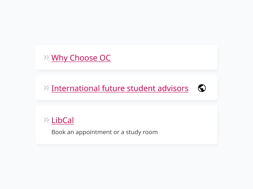
Modular links:
Linking system with options for tooltips and descriptions to enhance context and findability.
Tabbed content groupings:
Expandable tabs improve hierarchy and scalability as content grows.
CTA menu cards:
Visually prominent conversion touchpoints for student application to reduce time-to-action.
REFLECTIONS
Key takeaways
What I'm proud of
🔨 Breaking through organizational silos: Collaborating across 10+ departments revealed the deeper systemic problems beneath the surface.
📈 Experiencing live feedback: Not all designs have the opportunity to be tested by users before rollout, it was great to learn and adapt from users during the process.
✨ Maintaining resilience: Timeline pressures and technical limitations forced more intentional trade-offs.
What I would do differently
🔍 Find a baseline early: I joined the team mid-project, but measuring pre-redesign conversion rates or time-to-information rates would enable a stronger clarification on impact.
♠️ Card sorting: Most feedback before release was regarding what links and where the links are on navigation. If I can restart, card sorting can be useful to understand how our users would group content.