Okanagan College
Empowering conversion by transforming a fragmented discovery experience
Background
Okanagan College is a post-secondary institution with approx. 15000-20000 students each year. In this project, I created a scalable tabbed mega menu with CTA functionality and enhanced tooltips designed for digestibility and intuitive wayfinding.
Role
UX/UI Designer
Team
2 UX/UI Designers
1 Content Designer
1 Product Manager
2 Developers
Timeline
Mar. 2025 - Aug. 2025
Currently undergoing UAT,
to be shipped Jan. 2026
Skills
Systems design
Journey mapping
Prototyping
Information architecture
Stakeholder alignment
Impact
Designed 5+ components for our design system and collaborated with development for product requirements and seamless implementation.
Aligned 10+ departments through cross-functional feedback and design reviews.
Balanced multiple user segments and business constraints while maintaining focus on core user needs.
PROBLEM
A platform no longer serving us and our users
-30% enrolment drop in 2025
New federal regulations led to a steep international student enrolment decline, creating urgency to attract prospective students to fulfil this gap.
Overloaded staff
Inaccurate website information forced advisors to operate at maximum capacity to handle questions the website should have answered.
📌Goal
Maximize prospective student conversion while reducing support burden through improved information discovery.
RESEARCH
Validating a systemic problem
A survey with 800+ users (n = 820) was conducted to identify pain points. Qualitative feedback showed that users weren't frustrated with what information exists, but with finding information instead.
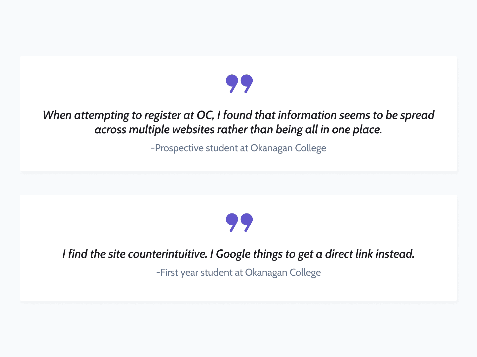
WHY WAS THIS HAPPENING?
No user focus
Outdated programs, student portals, and pages for staff are easily findable, showing unclear targeting on who the platform is actually for.
DEFINING THE USER
Why focus on prospective students?
While both current and prospective students struggled, we prioritized prospective students to address current student needs indirectly.
Higher sensitivity to friction
Prospective students leave immediately when facing obstacles. Current students persist due to sunk costs, masking navigation problems.
Exploratory vs. repetitive behaviour
Current students follow predictable paths (tuition, schedules). Prospective students explore broadly, exposing systemic navigation issues.
JOURNEY MAPPING
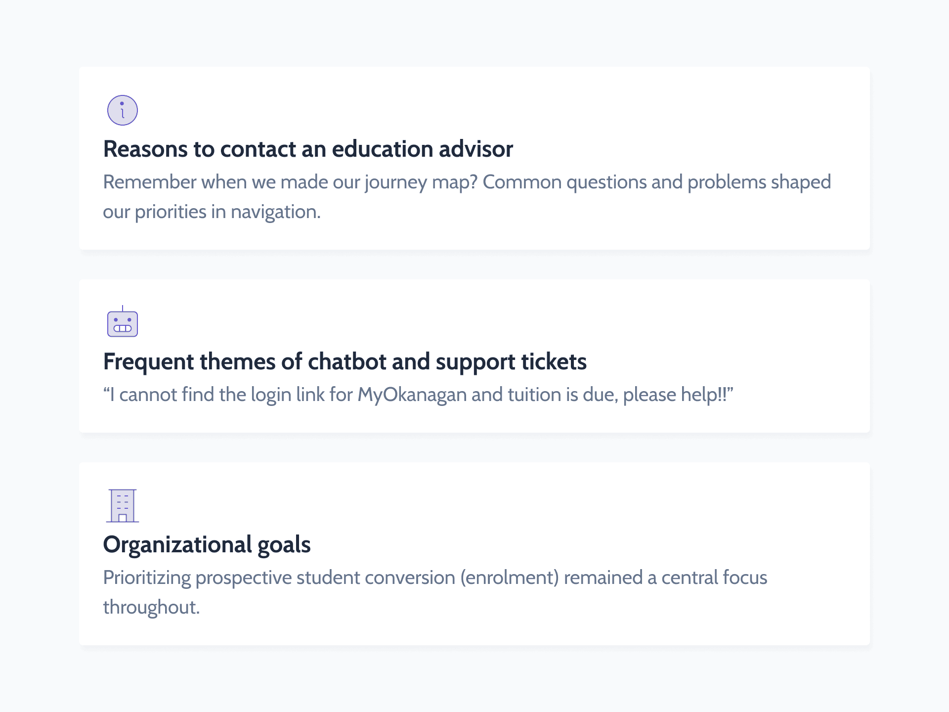
Breaking through silos to find opportunity
We collaborated with education advisors to better discuss our users' journeys, discuss the survey findings, and pinpoint navigation barriers. This experience provided specific areas in wayfinding our team can focus on.
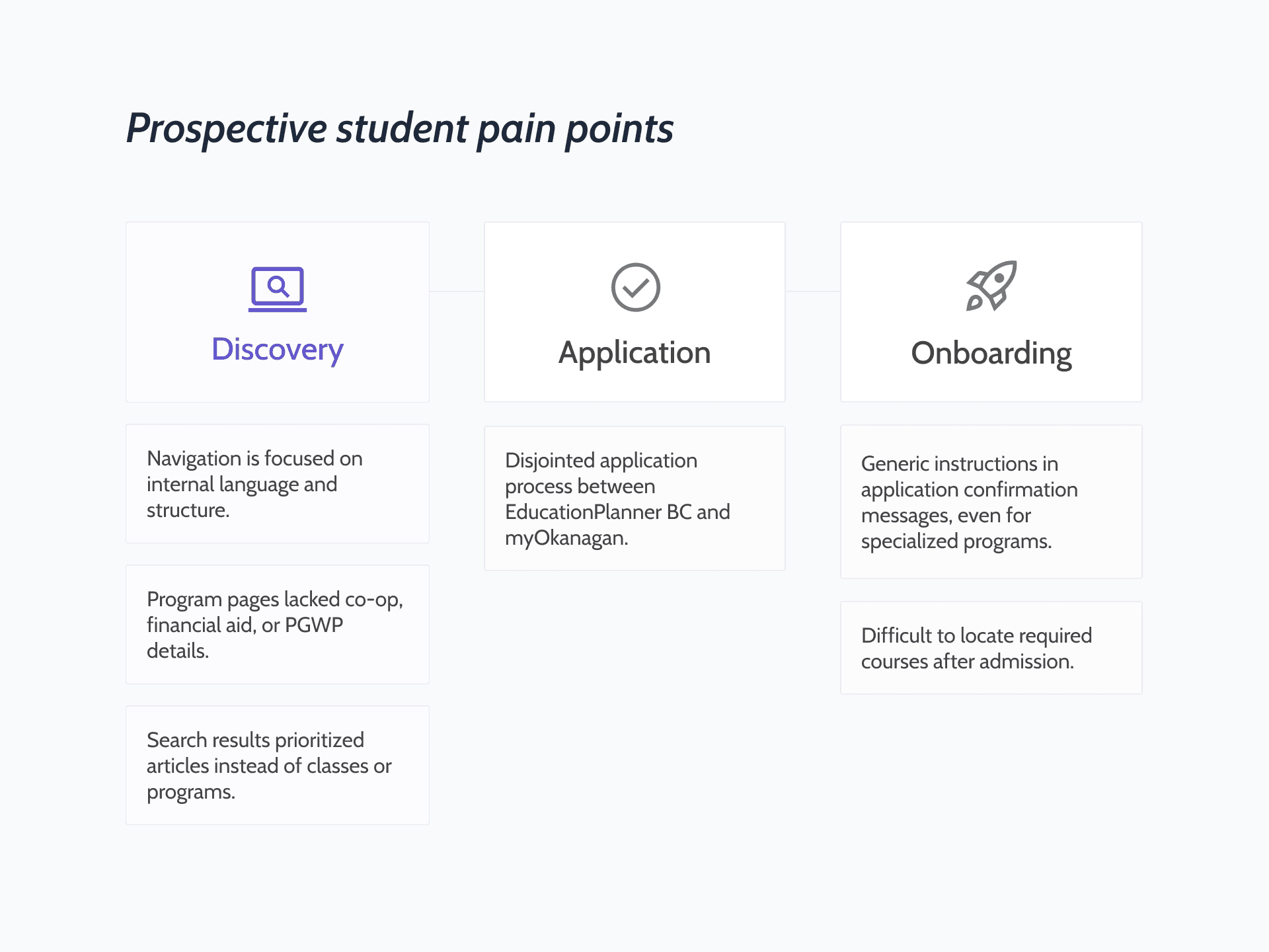
💡After understanding the prospective student journey, we've determined that the discovery stage is what we had the most control over in improving.
REFRAMING THE PROBLEM
How might we focus on prospective student conversion while improving the discovery journey for our users?
IDEATION
Achieving alignment by prioritizing impact
5+ departments had competing priorities: Marketing wanted easier program promotion, education advising wanted to streamline student support, tech had other ongoing projects, and so much more. A prioritization matrix helped us focus on the right ideas without going overboard.
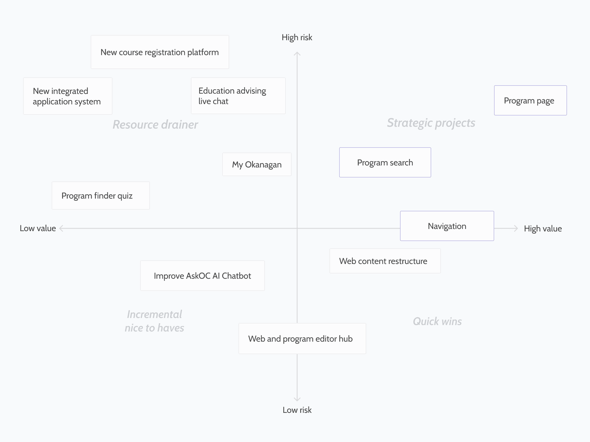
📌The ideal solutions
Given my initial timeline constraints, navigation improvements were addressed first. Program display pages and the optimized program search are currently underway.
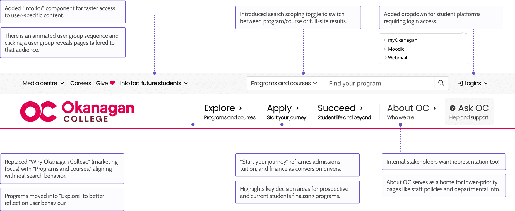
DESIGN ITERATION 1
Is simplicity best?
This first round of iterations focused on core user needs and low-risk design choices to mitigate against competing priorities and organizational challenges during this timeline.
Why I tried it?
Initially I only had a week to finalize designs, I focused on information hierarchy to reduce cognitive load through extreme simplification.
Why I moved on?
Minimalism limited scalability and visual differentiation. Stakeholders found it too similar to the current UI.
Gratefully, priorities shifted allowing my team more time to improve design choices.
DESIGN ITERATION 2
Maximalism with delight
Inspired by other post-secondary institutions across Canada, this round focused on improved usability, innovation, and delight.
❌ What didn't work
Tried to serve all audiences again, reintroducing the “serves everyone, helps no one” issue.
Designed for 1400px width, not the most scalable for tablets and mobile (a big no-no).
DESIGN ITERATION 3
Finding a balance and intention
This iteration restored focus on our primary focus users while retaining key enhancements.
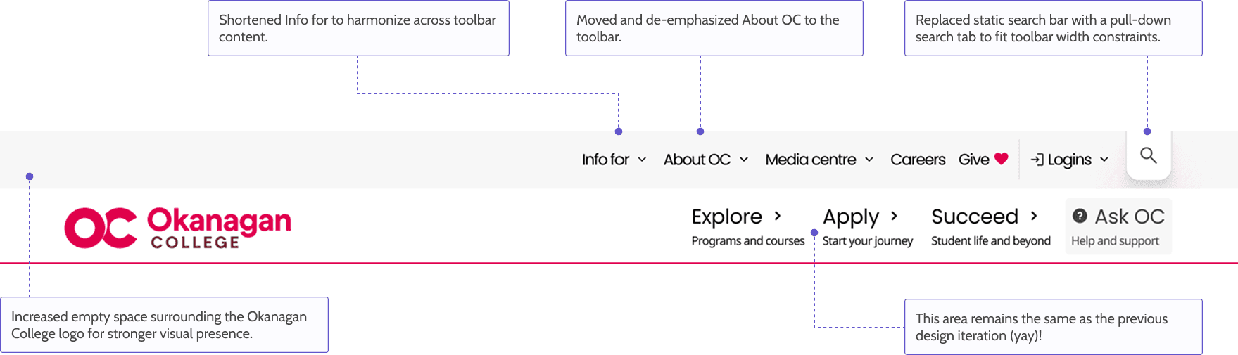
✅ Why this worked
Addressed responsive design needs while keeping core improvements intact.
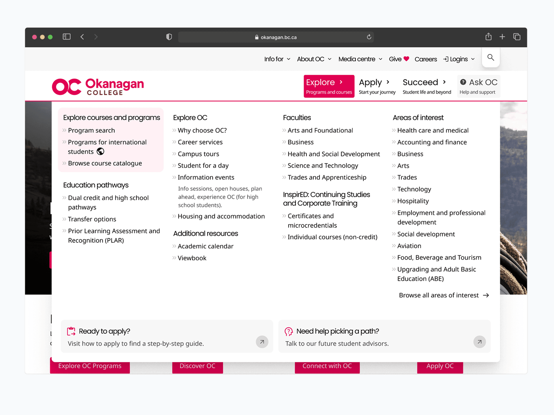
INFORMATION ARCHITECTURE
How was information re-organized into something that makes sense
The old IA mirrored internal departments rather than user mental models. The new IA is based on what users need to do, not who owns the content.
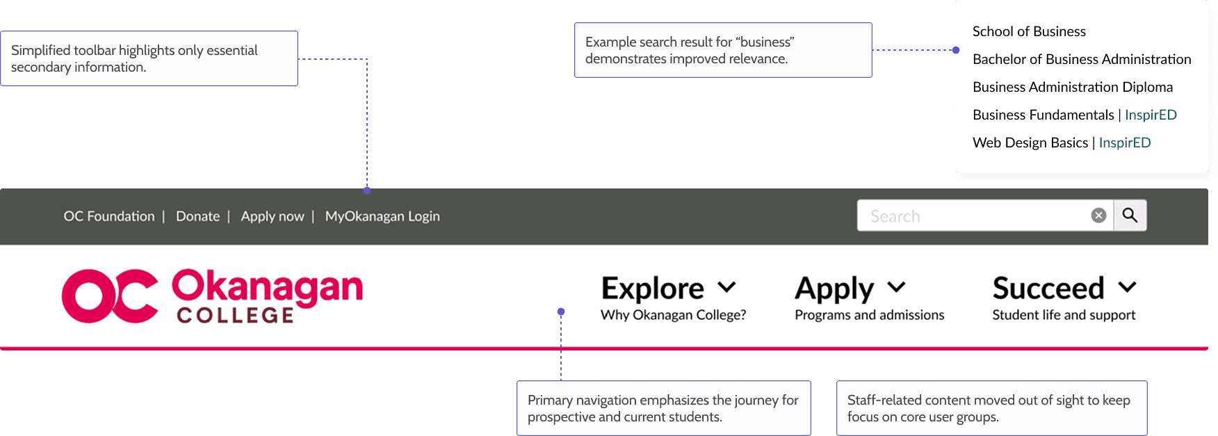
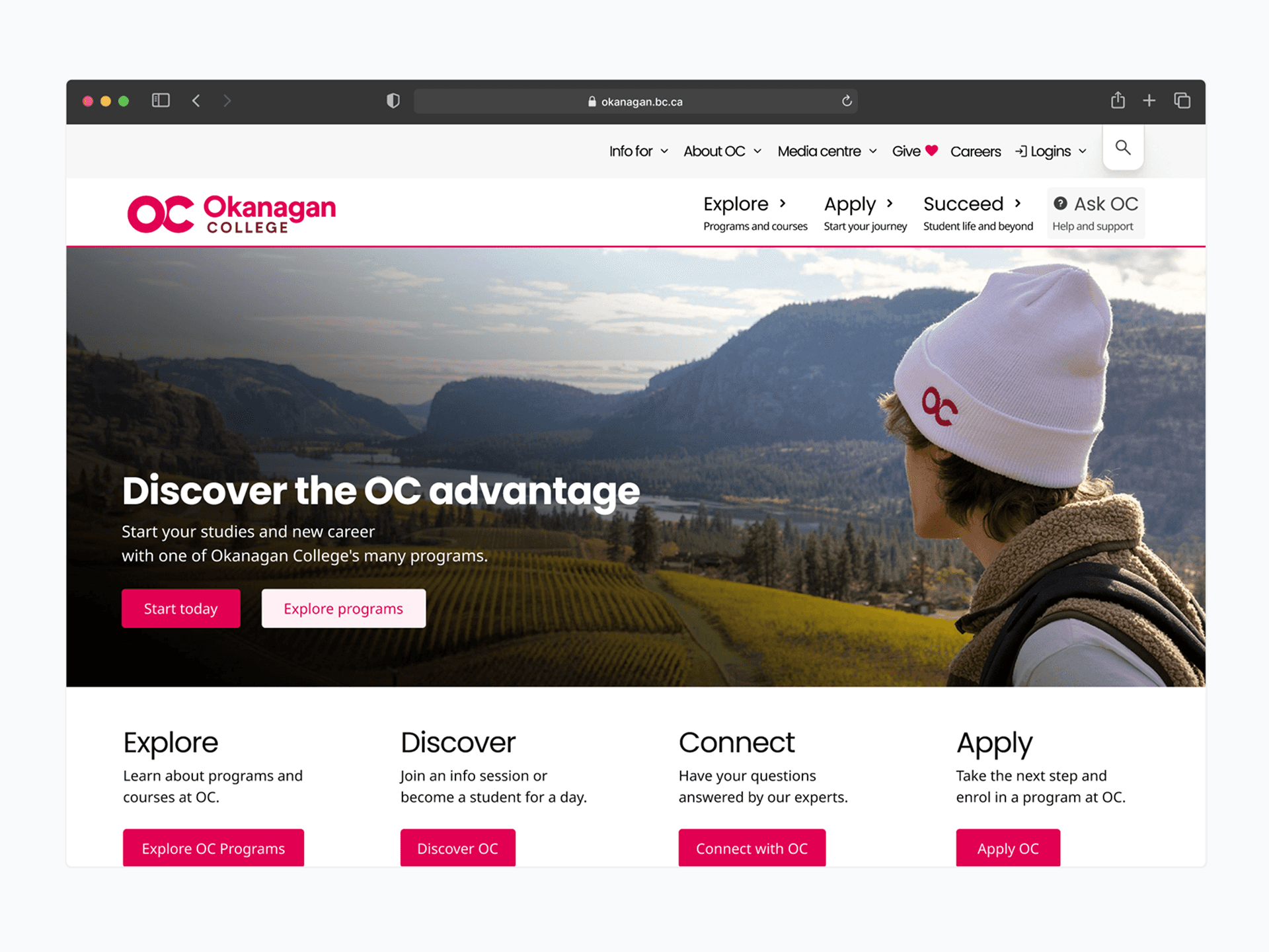
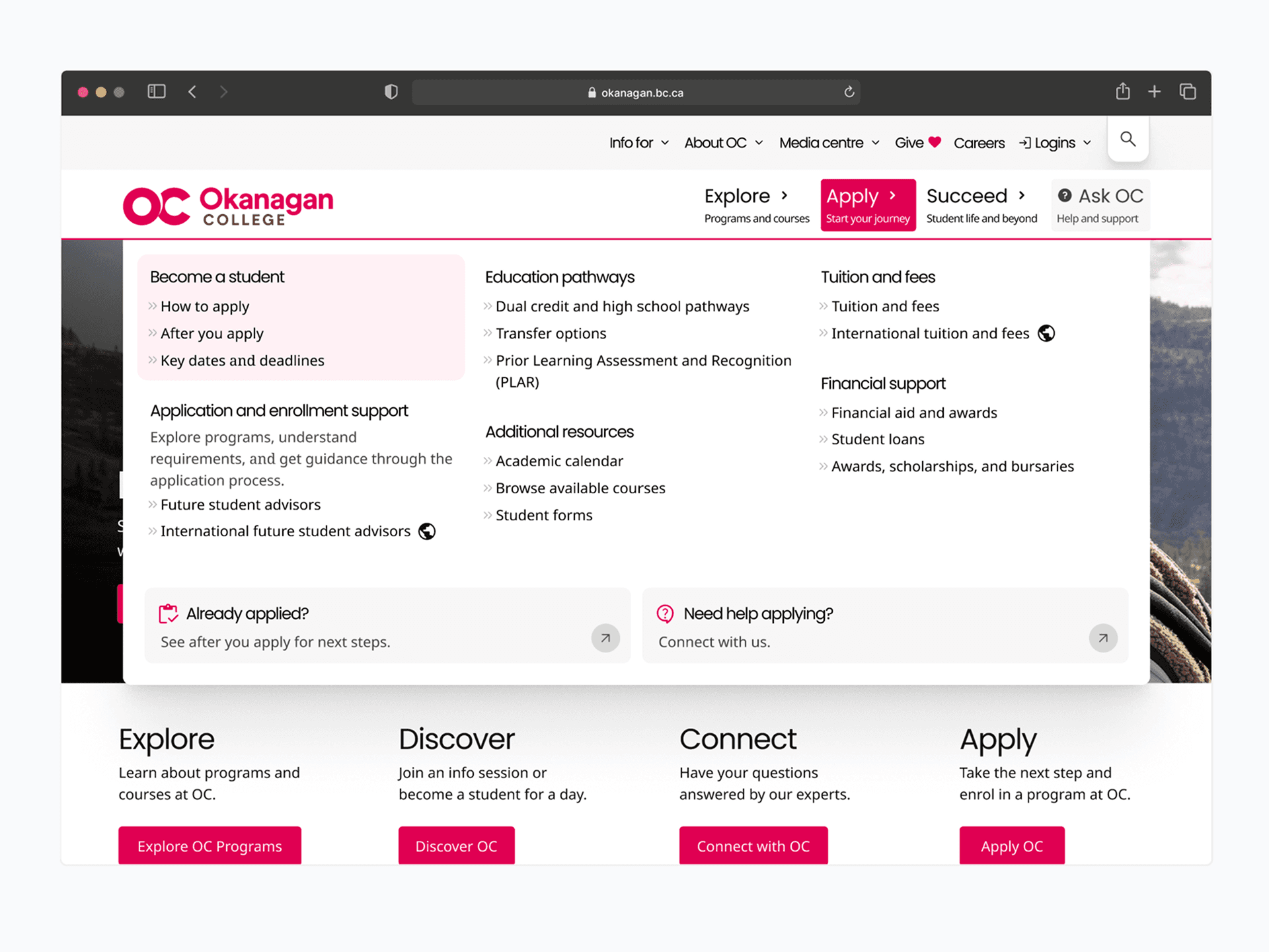
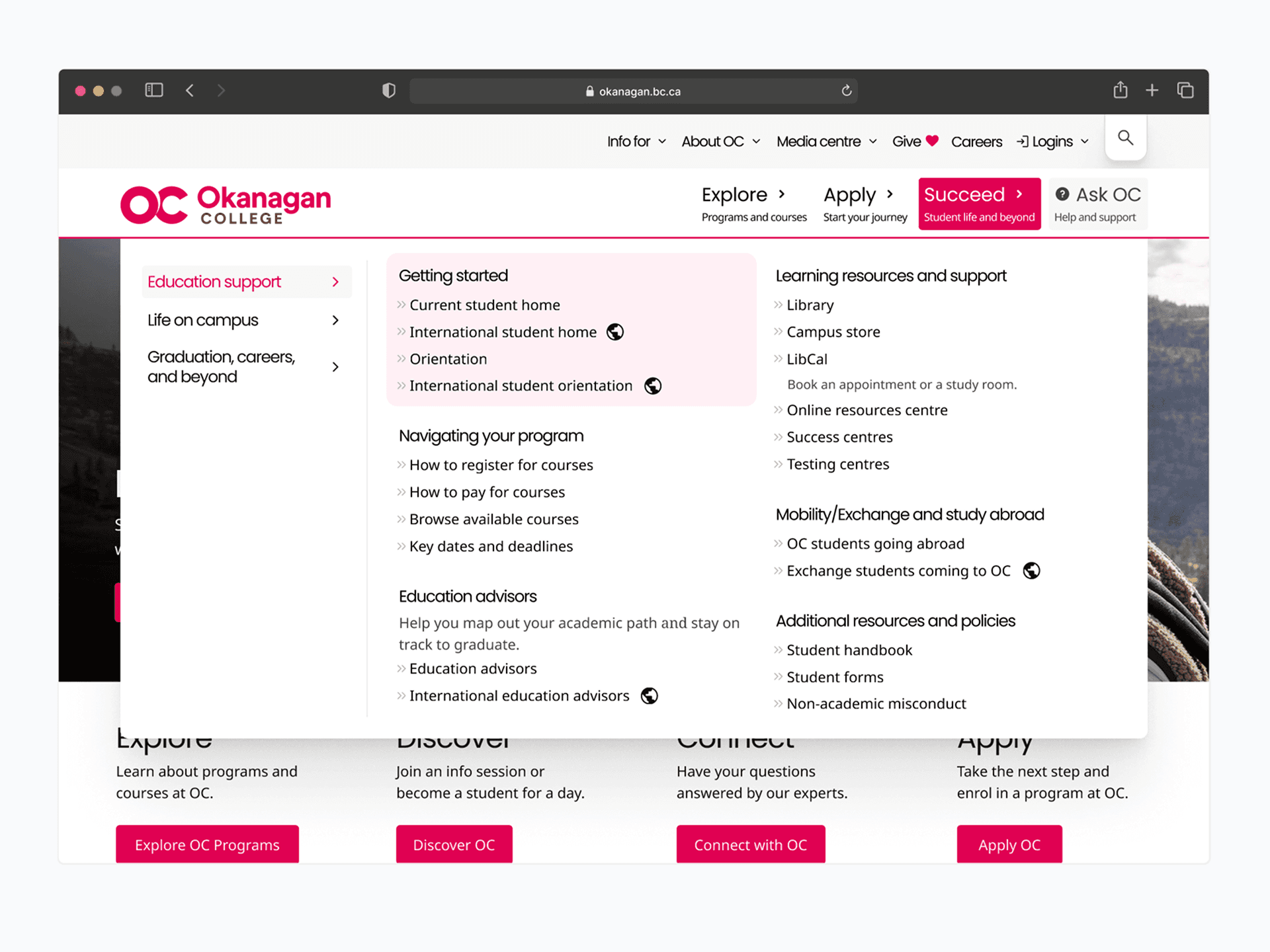
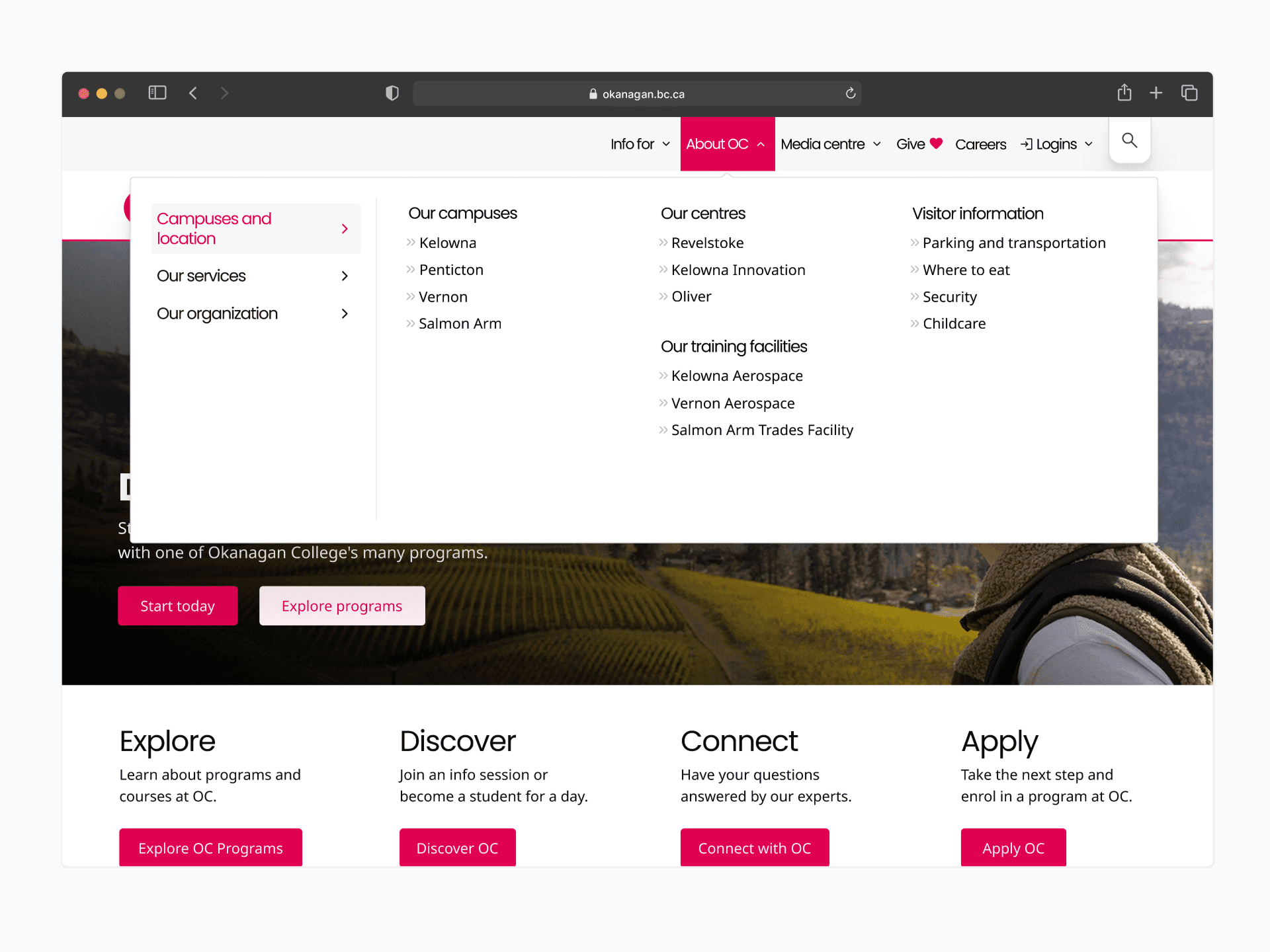
FINAL SOLUTION
A discovery journey designed for conversion and scale

Enhanced tooltips:
Descriptive hover states build confidence before clicking; icons can be customized by editors.
Modular links:
Linking system with options for tooltips and descriptions to enhance context and findability.
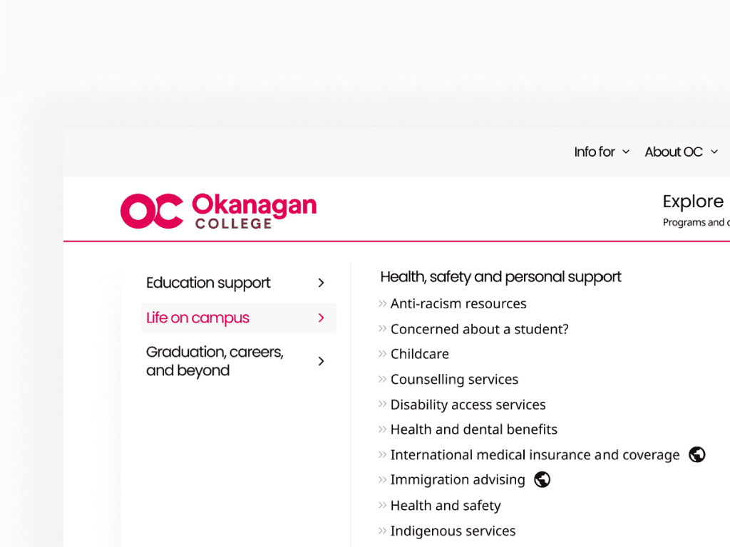
Tabbed content groupings:
Expandable tabs improve hierarchy and scalability as content grows.
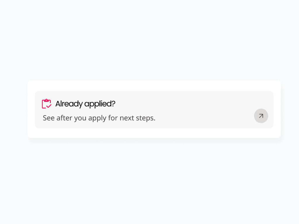
CTA menu cards:
Visually prominent conversion touchpoints for student application to reduce time-to-action.
REFLECTIONS
Key takeaways
What I'm proud of
🔨 Breaking through organizational silos: This is the College's largest design refresh in years. Collaborating across 10+ departments revealed the deeper systemic problems beneath the surface.
✨ Maintaining resilience: Timeline pressures and technical limitations forced smarter and more intentional trade-offs.
What I would do differently
🔍 Find a baseline early: I joined the team mid-project, but measuring pre-redesign conversion rates or time-to-information rates would enable a stronger clarification on impact.